The No-Trap Principle
A small empirical observation about a single missing UI row turned into a design rule that now governs every progressive-disclosure surface in the build tool — and surfaced four more design rules in the cascade that followed.
The Incident
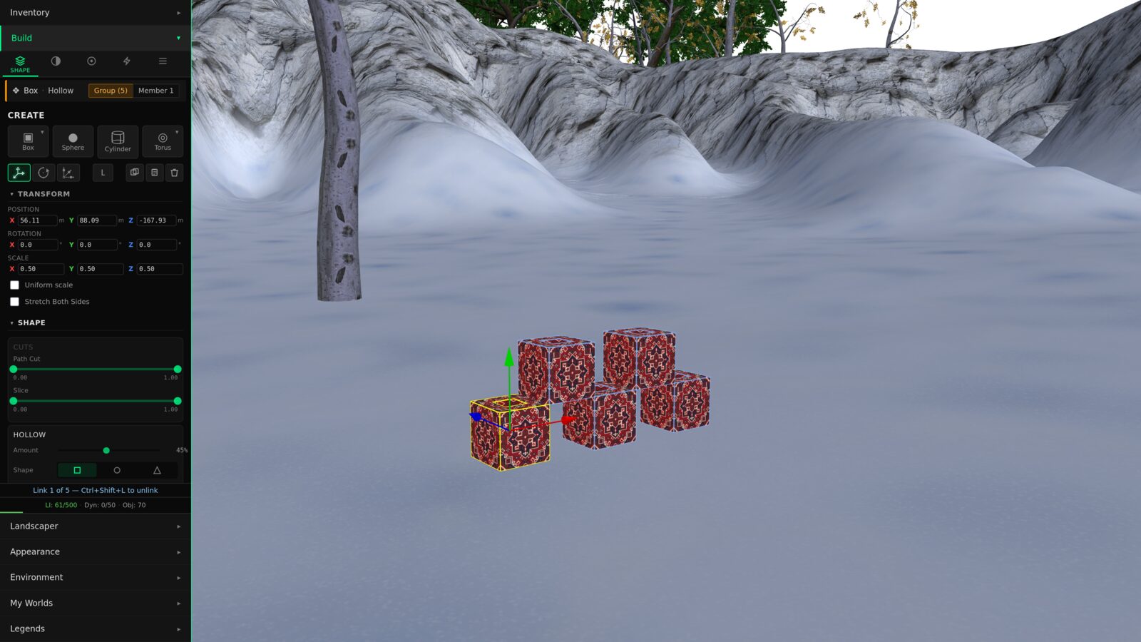
The build tool's Look tab exposes a row of controls for texture tiling: how the texture repeats across the surface, where it is offset, how it rotates. The row appears in the inspector when a texture is presently assigned in the active editing session.
The trap: if a texture is assigned to the surface through a different code path — an import from another world, a rez from inventory — and the inspector did not pick it up, the controls don't surface either. The user can see the texture rendering on the object. They just have no user-interface path to adjust it. The control they want is hidden by a workflow assumption that doesn't hold for their state.
The Rule
The first instinct was to patch the inspector: pick up the texture from the right source, surface the row. That patch would have been local. It would have closed the bug. It would not have produced a design rule.
The design rule the incident asks for, stated as compactly as it will travel:
Progressive disclosure — hiding rarely-used controls behind a workflow assumption — is a legitimate UX pattern. It reduces visual clutter, guides casual users through the common path, and lets the primary surface stay readable. The rule doesn't ban progressive disclosure. It just requires every hide-behind-workflow decision to come with an escape hatch.
The Decision Diamond
The rule has an operational form. Three questions, asked before any UI surface ships:
The third question is the gate. Any "no" outcome either ships a trap (rejected) or removes the parameter from the UI entirely. The "All Properties" affordance can take whatever form fits the surface — keyboard shortcut, right-click menu, visible button, breadcrumb navigation upward — as long as it is reachable from the state where the user got stuck.
ever relevant to
any user state?"} Q1 -->|No| A1["Don't ship it"] Q1 -->|Yes| Q2{"Is it always shown
in the primary UI?"} Q2 -->|Yes| A2["Done.
No progressive
disclosure needed"] Q2 -->|"Hidden
by default"| Q3{"Is there an
'All Properties'
escape hatch?"} Q3 -->|Yes| A3["Ships clean ✓"] Q3 -->|No| A4["TRAP ✗
fix before merge"] classDef question fill:#1e1e1e,stroke:#0099ff,color:#e0e0e0 classDef good fill:#1e1e1e,stroke:#4caf50,color:#4caf50,stroke-width:2px classDef bad fill:#1e1e1e,stroke:#f44336,color:#f44336,stroke-width:2px classDef neutral fill:#1e1e1e,stroke:#666,color:#999 class Q1,Q2,Q3 question class A2,A3 good class A4 bad class A1 neutral
What A Trap Looks Like
The contrast between a clean surface and a trap is small, but the user experience gap is large.
The third surface is what the original incident produced. The second surface is what the principle requires. The first is what you ship when you also want primary-surface convenience.
Why The Rule Travels
Compact rules travel further than complex ones. The compact form of the no-trap rule fits on a sticky note, on a pull-request review checklist, on a contributor's onboarding doc.
That brevity is the rule's primary feature. The expanded version — the decision diamond, the affordance taxonomy, the specific implementations — matters at the moment a designer sits down to ship a surface. The compact mantra matters every other moment: when reviewing a pull request, when reading an architecture document, when teaching a new contributor what constraints the design tradition carries.
The Cascade
The TILING incident was the beginning of a larger arc. The fix spawned an extension to the build tool's Look tab. The extension needed a material picker. The material picker needed somewhere for newly-authored materials to live. That spawned an asset-authoring framework. The framework needed a place to surface cost feedback. The cost feedback surfaced a redesign of the budget chrome. The budget chrome redesign surfaced a question about tier framing. The tier framing question surfaced a question about whether character progression and creator progression should be two facets of one identity.
Each step surfaced a new principle:
one missing UI row"] INC --> R1["No-Trap rule
workflows guide, don't gate"] R1 --> EXT["LookTab augmentation
per-face PBR + nested editors"] EXT --> NEED1["Need: material picker"] NEED1 --> AUTH["Asset-Authoring framework
13 create paths, 3 archetypes"] EXT --> NEED2["Need: cost-meter feedback"] NEED2 --> BUDGET["Advisory Budget principle
configurable, drift over time"] BUDGET --> DASH["Game-feel dashboard direction
radial polygon + tile grid"] DASH --> TIER["Aspirational Tier framing
horizon ring, achievement markers"] TIER --> DUAL["Dual-Progression speculation
Akashic ↔ Builder facets of one identity"] EXT --> VL["Visual-Language Compatibility
design against existing primitives"] VL --> CHROME["Chrome-is-the-Function
encode the curve in the widget"] classDef start fill:#1e1e1e,stroke:#0099ff,color:#0099ff,stroke-width:2px classDef rule fill:#1e1e1e,stroke:#c2185b,color:#ff6dc7,stroke-width:2px classDef feature fill:#1e1e1e,stroke:#666,color:#e0e0e0 classDef speculative fill:#1e1e1e,stroke:#666,color:#999,stroke-dasharray: 5 5 class INC start class R1,VL,CHROME,BUDGET rule class EXT,NEED1,NEED2,AUTH,DASH feature class TIER,DUAL speculative
No-Trap: workflows guide; they don't gate.
The constitutional rule of progressive disclosure. Every surface that hides controls must offer an escape hatch reachable from every state where the controls would otherwise be hidden.
Visual-language compatibility: design against existing primitives.
New UI surfaces should compose from the visual primitives the host system already speaks — not introduce new vocabulary. Reducing vocabulary is a virtue; expanding it forever expands the cognitive load of every future implementer.
Chrome is the function.
When a parameter has a non-uniform shape — logarithmic, bimodal, action-zoned — the control's visual chrome should encode that shape, so the user's intuition reads the curve from the geometry of the widget. Linear sliders silently claim every increment matters equally, which is almost never true.
Budgets are advisory, configurable, and drift over time.
Performance budgets shouldn't be hard-enforced thresholds in source code. They are signals for users with different hardware and preferences, with coefficients that move as the engine matures. Hard thresholds in source require redeploys; advisory thresholds in server-config don't.
Game-feel beats spreadsheet-feel.
Builders are creative makers. Treating their performance budget as a stat-block — a colorful dashboard instead of an abbreviated text strip — reframes "you are hitting limits" into "here is your build's profile." Same data, different mood.
Three of these became ratified design rules in the same week the incident was reported. Two more are reserved as future cross-cutting design ADRs to be drafted when the cross-coupled initiatives they support kick off in earnest.
Try it: chrome that encodes the curve
The third principle — chrome is the function — is easier to feel than to describe. Below is a single parameter, "texture repeat," wired to two different controls. Drag either one. The value updates in both, and the live tile preview shrinks or grows accordingly. See where each control gives you delicate motion and where it wastes its travel.
The Methodology Behind The Cascade
The cascade is not magic. It happened because the design work was structured to surface adjacent rules, not just close adjacent bugs. Four practices made the difference.
Ground every proposal in the existing surface.
Every UI mockup composed only from primitives already present in the host system, with the constraint enforced explicitly. The visual-language audit grew from nine catalogued primitives to twenty as more of the existing surface was inventoried; almost nothing new needed to be introduced. The constraint surfaced the principle.
Ratify the rule alongside the feature.
Every time a working session produced a feature decision that depended on a principle nobody had named yet, the principle got named — in its own document, with its own pull-request review check. Compact rules travel only after someone writes them down.
Reserve future slots even when not drafting them.
When a session surfaced a rule that wanted to be its own cross-cutting design document, but the cross-coupled initiative wasn't ready yet, the slot was reserved with a short stub. The rule waited. The next session that needed the rule would find a numbered slot pre-claimed for it. Pre-allocation prevents the slot from being lost.
Split the work across complementary perspectives.
The technical track owned engine and persistence decisions. A separate UX track owned visual-language and mockup decisions. The two tracks coordinated through a single comms document with explicit hand-off points. One problem, two ownerships, a shared surface that imposes turn-taking.
Multi-Instance Design As Methodology
The session that produced the no-trap rule was a multi-track design collaboration: two parallel design instances, each owning a different ownership slice, coordinating through a single shared document. It is worth naming the methodology because the conditions that made it work are reproducible.
comms
document"| UX Tech --> SYNC["Synthesizer
(ratifies / redirects)"] UX --> SYNC SYNC --> OUT["3 ADRs ratified
+ 5 future slots reserved
+ 11 runnable mockups"] classDef track fill:#1e1e1e,stroke:#0099ff,color:#e0e0e0 classDef sync fill:#1e1e1e,stroke:#ff9800,color:#ff9800,stroke-width:2px classDef output fill:#1e1e1e,stroke:#4caf50,color:#4caf50,stroke-width:2px class T1,T2,T3,U1,U2,U3 track class SYNC sync class OUT output
One problem, two genuine ownerships.
Splitting work that doesn't have two real ownerships produces noise. Splitting work that does — engine decisions versus visual-language decisions, for example — produces parallel progress neither track could have produced alone.
A shared comms surface enforces turn-taking.
Each track reads the other's most recent entry before drafting its own. Hold-points prevent one track from speculatively running ahead into territory the other will need to revise.
A constraining contract keeps both tracks in the same world.
Without a contract — "design against existing primitives, not around them" — the tracks drift into incompatible vocabularies. With one, the seam between their work stays thin.
Mockups as runnable artifacts.
Visual proposals lived as HTML pages opened in a browser, not as illustrations described in prose. A reviewer could open the proposal next to the live surface and confirm "this lives in the same world." The artifact was the decision; the decision was the artifact.
The Larger Pattern
This chapter, taken with the previous two, names a disposition rather than three separate fixes. The disposition is the question you ask when you find a bug:
Chapter 12 said it about geometry: don't patch the cascade, remove the source. Chapter 13 said it about persistence: don't patch the field, ratify the canonical type. This chapter says it about interfaces: don't patch the inspector, ratify the rule.
Three different layers. Three different forcing functions. One architectural disposition: when you find a bug, ask what kind of bug it is, and fix the class.
The Full Mockup Set
Eleven HTML mockups emerged from the design session, ranging from shipped-soon (the LookTab redesign) to speculative-roadmap (the dual-progression dashboard that pairs creator caps with character growth). Each is a runnable proposal using live theme tokens from the build panel — not screenshots. Open any in a new tab to see it at full size.
What's Next
The work that emerged from this design session continues forward on several tracks — the asset-authoring framework, the budget dashboard direction, the dual-progression speculation that pairs character growth with builder capacity. Each carries its own constitutional question. Each will get its own chapter when the implementation lands.